
US rolling deficit increasing – bullish for the economy and equities
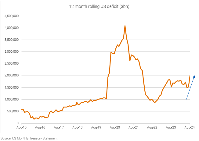
What it means
The US deficit is on the rise again as the monthly US Treasury Statement posted a US$380bn deficit in August. This takes the rolling twelve-month total above the previous twelve months, suggesting the economy is about to re-accelerate.
In keeping with our article from last month, Is the US headed for recession, while there is plenty of talk of a US recession, we believe the current policy settings mean this risk is very low. In fact, the data is good news for risk assets, as the re-acceleration in the deficit is likely to show up in corporate profits in the coming quarters, as per the Kalecki profits equation.
The deficit spending has put the US household in strong financial health
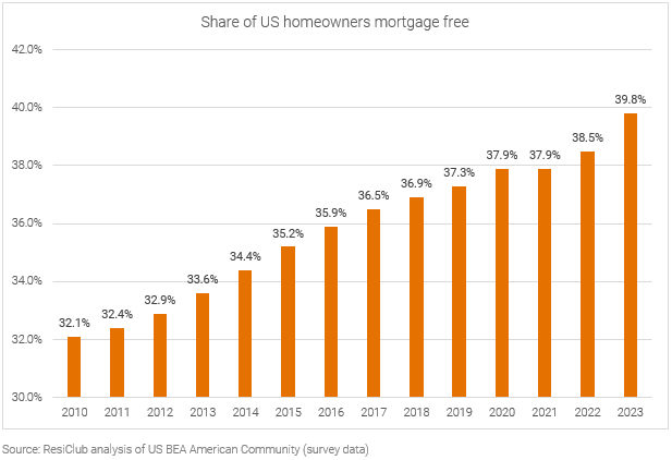
What it means
As per the sectoral balances, the ongoing US government fiscal deficit results in non-government (households and business) fiscal surplus. The ongoing accrual of household savings has resulted in more Americans living mortgage-free compared to any other time this century.
The implications may be profound.
Household consumption typically makes up two thirds of GDP, so any fear about the US economy needs to focus on the balance sheets of households – and based on this data – they have rarely been in better shape. This probably explain why US retail sales continue to surprise to the upside1.
There is little to no relationship between interest rate and inflation
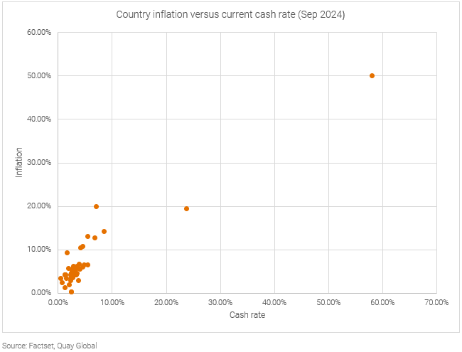
What it means
As the Federal Reserve and other central banks begin their rate-cutting cycle, some may voice concerns it may be too early or too aggressive in its actions. The concern is, until the inflation demon has been slayed, interest rates should remain higher for longer.
The problem with this argument is there is very little evidence higher interest rates corresponds with lower inflation or vice versa. In fact, the data above suggests the opposite is true.
As we wrote in our article, Why are we listening to central banks?, interest rates are a blunt policy choice to solve for complex economic problems. And the by-product of high interest rates is it adds to the income of net cash holders (usually the wealthy). Further, while some may argue high labour costs feed into high inflation, the same should be true for high capital costs.
The above chart supports this notion.
So as interest rates begin to fall, don’t bank on it being a catalyst for inflation to return.
High interest rates are not always “restrictive”
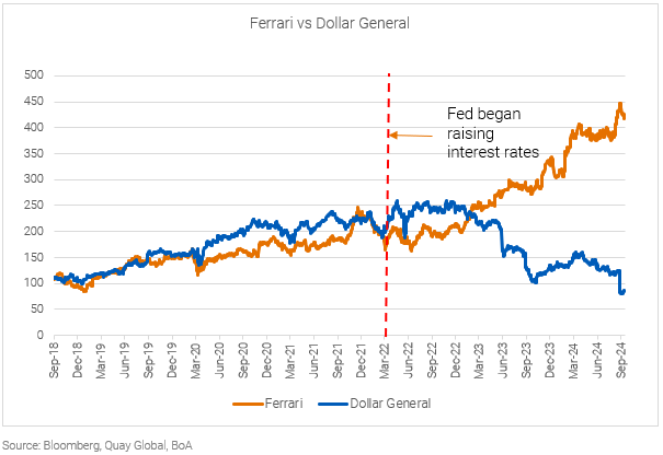
What it means
Since central banks began increasing interest rates, mall and other retail landlords have been telling us luxury and sub-lux offerings have been performing well, while middle market and discount retailers are struggling.
This chart highlights this theme nicely.
We see this as another side effect of ‘restrictive’ monetary policy. An example of hitting the accelerator (higher interest income to those with net cash) and the brake (higher interest expense for those that borrow) at the same time. The result is not only an economy that does not slow as expected, but creates clear winners and losers as the chart above highlights.
The lesson? Just as ‘restrictive policy’ was not restrictive for all, ‘easy policy’ may not be so easy for many.
Could the Australian version of the ‘Sahm Rule’ worry the RBA
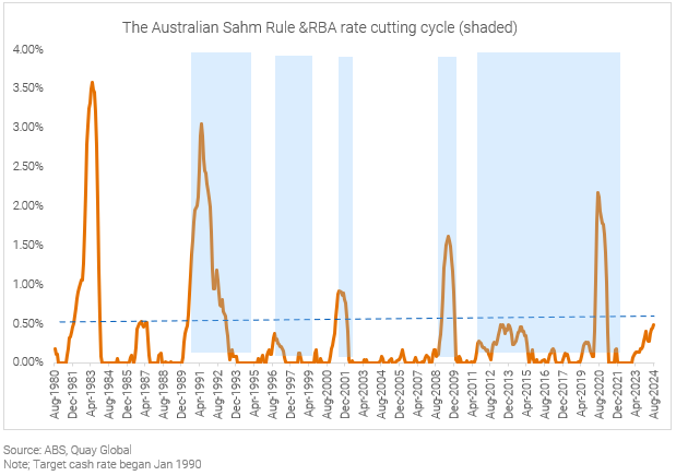
What it means
Last month, we highlighted a potential US ‘recession predictor’ called the Sahm Rule. In summary, the rule states that a recession begins if the three-month moving average of the national unemployment rate rises by 0.50 percentage points or more relative to the minimum of the three-month averages from the previous 12 months.
Applying this metric to Australian data since the 1980s highlights this rule is a pretty good indicator of a weakening economy and associated interest rate cut (if not recession).
Based on the August employment report via the ABS, this number currently sits at 0.49%.
Evidence capital gains tax policy has no impact on property prices
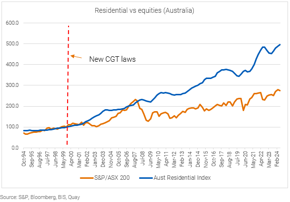
What it means
On September 1999, the then-Howard government changed the capital gains tax law from allowing investors to index their cost base (to CPI), to effectively halving the capital gains rate for assets held more than one year.
As the housing debate rages many commentators point to this tax change as a core reason Australian residential prices have soared this century – yet we see no evidence it had any impact on assets that had a similar advantage to the changes – namely equities.
It clearly busts the myth CGT changes altered the property market. And if this gets you thinking, the following charts will bust another myth.
Population growth does not explain the housing crisis or property performance.
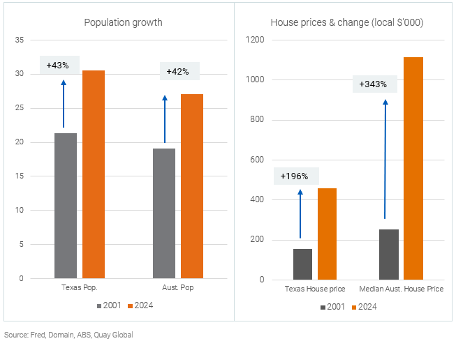
What it means
Texas is the second largest state in the US and has some similarities to Australia.
- Both economies are supported by the resource and service sectors.
- The population for both was around 20m at the turn of the century.
- The population has increased around 40% over the past 23 years.
- Most of the population growth is from external sources (immigration).
Despite almost identical population sizes and growth profiles, the absolute value of house prices and rate of change is significantly higher in Australia.
Population growth does not drive house prices.
US industrial leasing demand running well ahead of trend
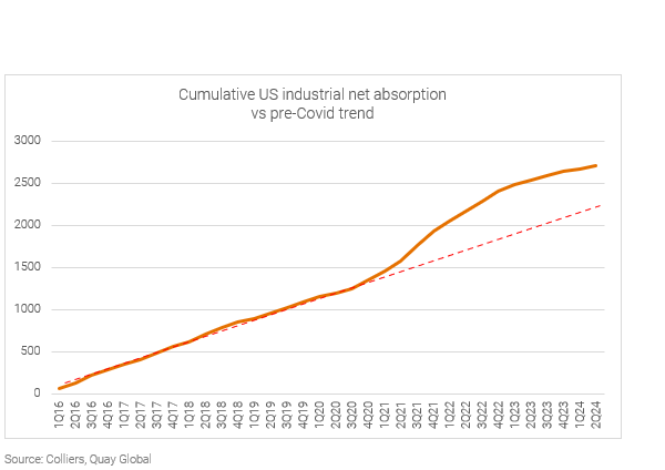
What it means
Moving from residential to commercial real estate, we continue to see the distortive effects of the pandemic on some fundamentals today.
US industrial property has underperformed most other REITs in 2024 as a sudden and “unexpected” decline in tenant demand caused some listed REITs to downgrade earnings this year. Management teams have struggled to explain why demand (now running at 1/4th the level of previous years) has dropped off so much despite a strong economy.
The answer can be seen in the chart above. A combination of surging online consumer demand and lack of new supply during the pandemic pushed tenants into a ‘land-grab’ mindset – signing new leases in excess of immediate needs for fear of missing out.
Tenants now need to naturally grow into their commitments – which means the US industrial leasing outlook will probably remain weak for a for more years yet.
When ‘new experts’ are really just ‘new entrants’
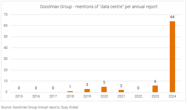
What it means
As the industrial market cools, high flying industrial REITs need a new story and a new use for their now excess land.
Enter: data centres.
There is little doubt for the need for data centres. The near-term demand and supply mismatched was explained in our article, 14 of the most important charts for data centres right now.
However, be wary of companies that were once experts in one area (logistics) and now attempt to portray a deep expertise in a brand new sector. Especially if they are only now deciding to discuss these opportunities while they gear up to compete against global companies with decades of experience.
As the chart above highlights, one company that is trying to convince investors of this switch is Goodman Group. Yet, a cursory glance at past annual reports reveals an uncomfortable truth: that maybe this is just another case of a company jumping on a bandwagon. To be fair, it’s a good bandwagon to jump on, but developments are tricky, and execution is not always perfect, especially for new entrants.